Using Skylight to Solve Real-World Performance Problems [Part I: OSEM]
This post is the first in a three-part series and is a write-up of the talk we gave at RailsConf 2018. You can find the slides here.
Every single app — large or small, open source or not — has room for improvement when it comes to performance. This is why we created Skylight for Open Source to give open source contributors the tools they need to find these issues.
Last month, we decided to try contributing back ourselves. We had a company-wide OSS-athon (like a hackathon, except we all contributed to open source projects), and we paired up to help improve performance improvements for some of our favorite open source apps.
Over the next week, we'll show you three different open source apps running on Skylight, each with their own unique performance challenges, varying in complexity.
An Introduction To OSEM
OSEM stands for Open Source Event Manager, an event management tool tailored to Free and Open Source Software conferences. It’s a one-stop-shop to set up a website for your conference, handling everything from schedules, registration, sponsorship as well as the admin interface for editing all these content.
Since OSEM is designed to be a self-hosted solution, working on performance issues could be tricky, since you will need real data and traffic to understand how the code is performing in the real world.
Luckily, one of the maintainers of OSEM recently used the app to organize a conference called LinuxFest Northwest 2018, so you can see OSEM working in action on the conference website.
When looking at OSEM's performance dashboard on Skylight, we can quickly make a few basic observations.
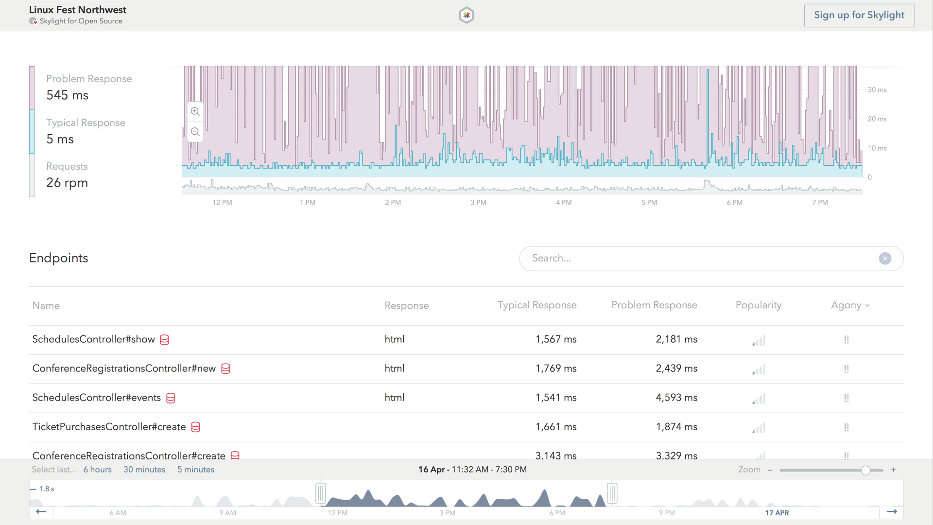
First, we'll notice that the app's typical response line is represented by the blue line, while its problem response is represented by the purple line. The number of requests received by this app per minute is represented by the grey section at the bottom.
The more technical names for the "typical" and "problem" response times are the median and 95th percentile, which is a pretty good proxy for what a typical user of this instance of OSEM would experience on a "typical" day and on a rainy, "problematic" day (read on for more about this!).
The second half of the dashboard is home to the endpoints list. This shows us all the endpoints in OSEM's app, including their typical and problem response time, as well as each endpoint's popularity.
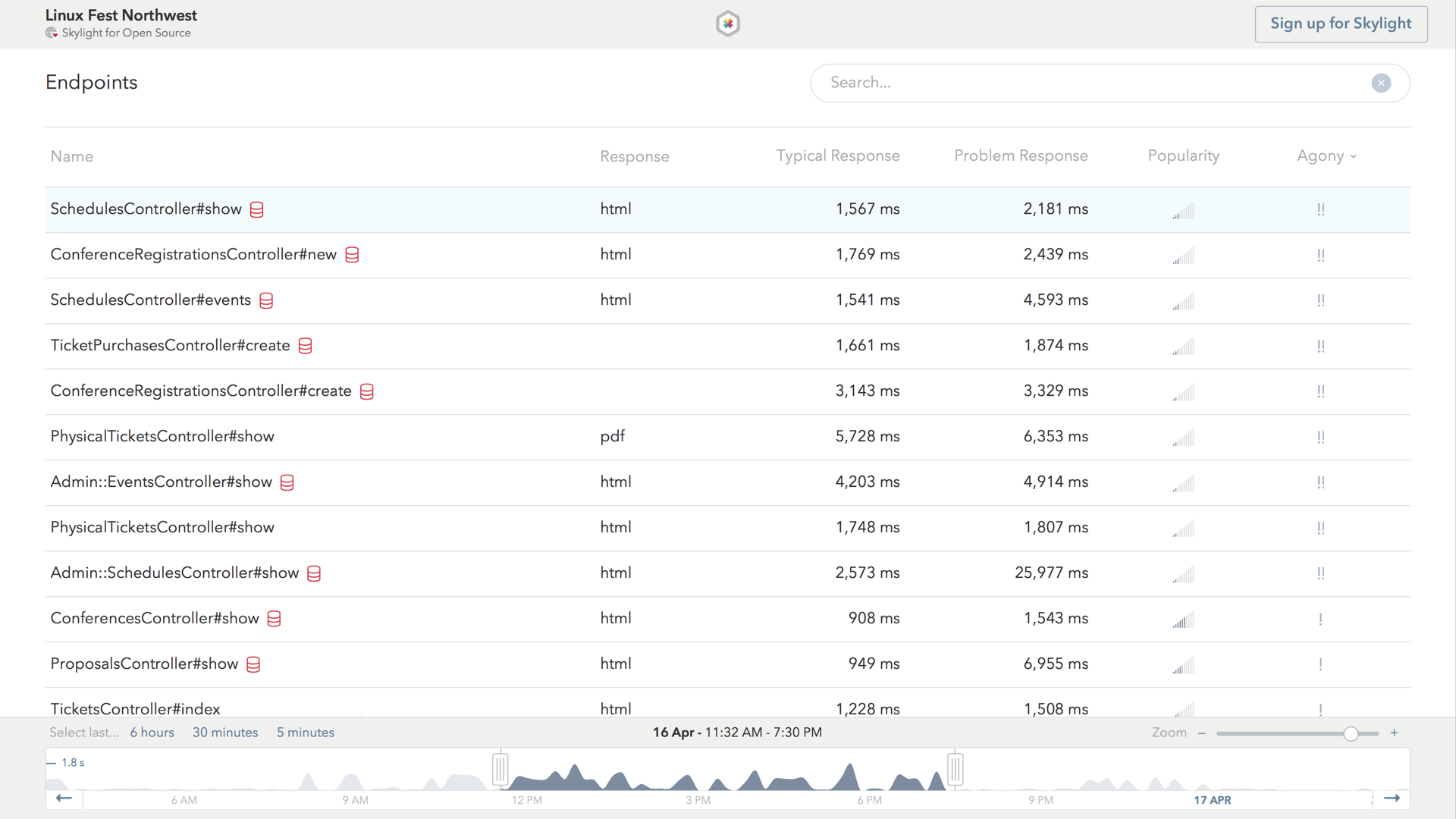
By default, endpoints are ranked by agony, which helps us prioritize which performance issues are worth spending our time fixing. It takes into account both how slow the endpoint is, as well as how popular it is, so that we don't waste our time fixing a slow endpoint that is only accessed by a handful of people each day.
If we have sharp eyes, we might also notice the red heads-up icon, right next to the endpoint name for SchedulesController#show. This icon indicates potential database issues. If we click on the first row to see the detailed endpoint page, we can investigate this further.
Investigating OSEM's Agonizing Endpoints
The first thing we'll notice is the histogram on the top. This shows us a log-normal distribution of our response time.
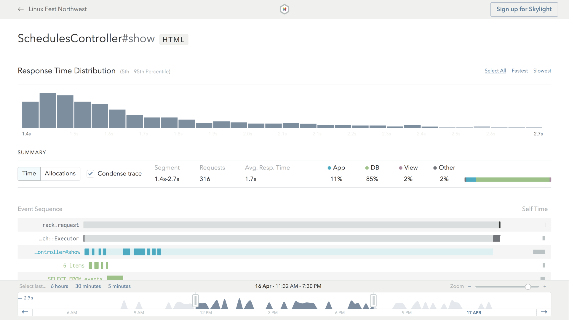
The second half of the page shows us what our app actually spent time doing during the request. For example, as we might expect, most of the time in the request is spent processing the controller action, which is indicated by the bright blue bar.
However, a lot of the time is spent doing other things within the action, such as database queries and rendering views, which is why parts of the blue bar are painted in light blue. These child tasks are also color coded – green is for database-related things, and purple is for view rendering.
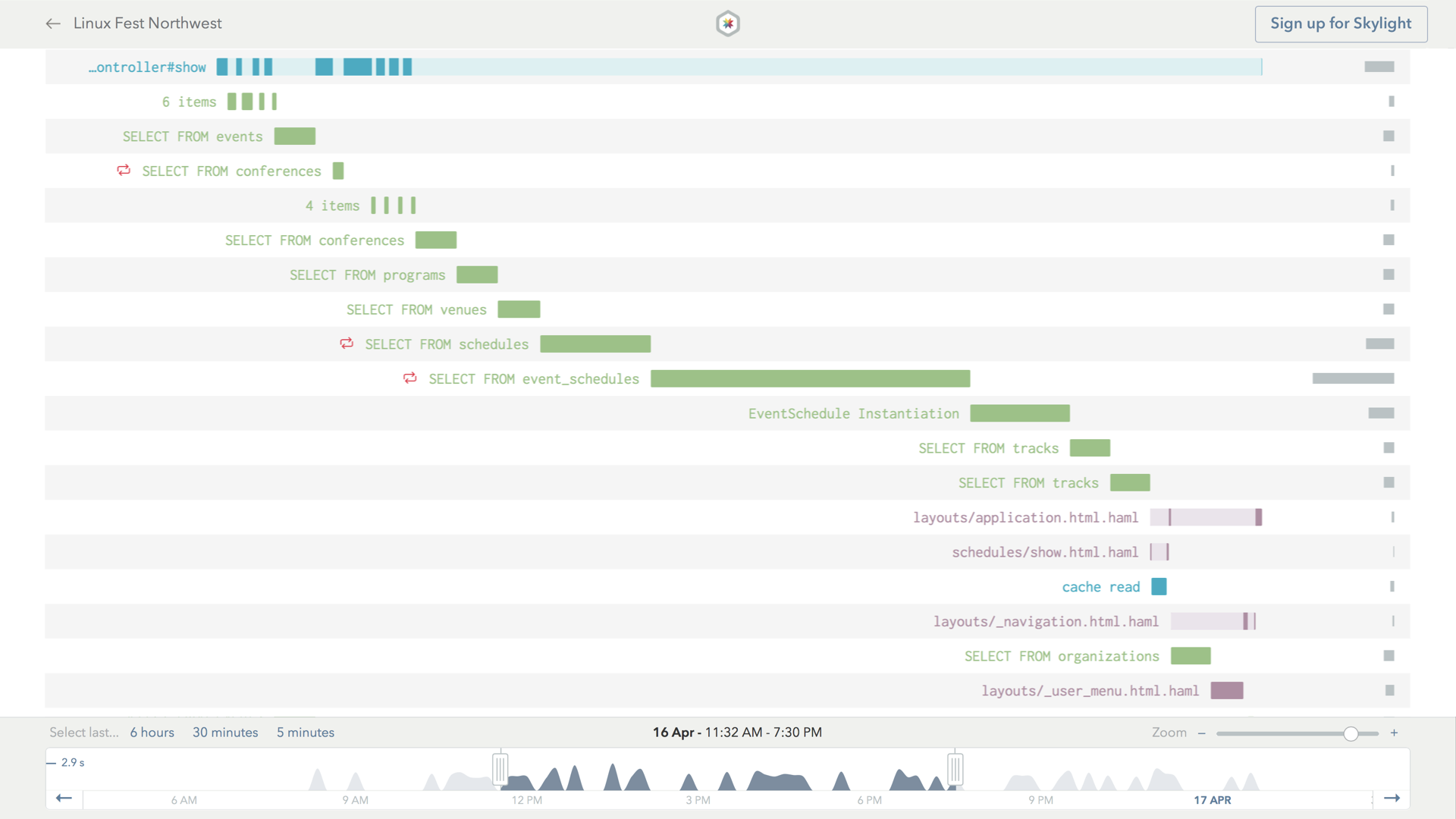
We can click on the database event to view more details, such as the actual SQL query being executed.
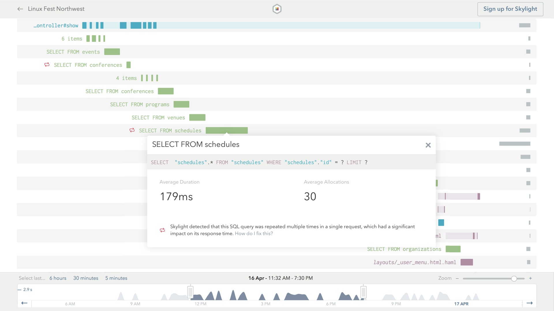
The endpoints page we saw earlier had a heads-up icon referring to a potential database issue in this endpoint. It corresponds to this red icon here, which refers to a pretty common kind of database issue in Rails apps called N+1 queries.
"N+1 Queries" are a very common cause of repeated queries in Rails applications. This happens when we do something like make a request for a single row in one table, and then make an additional request per element in a has_many relationship.
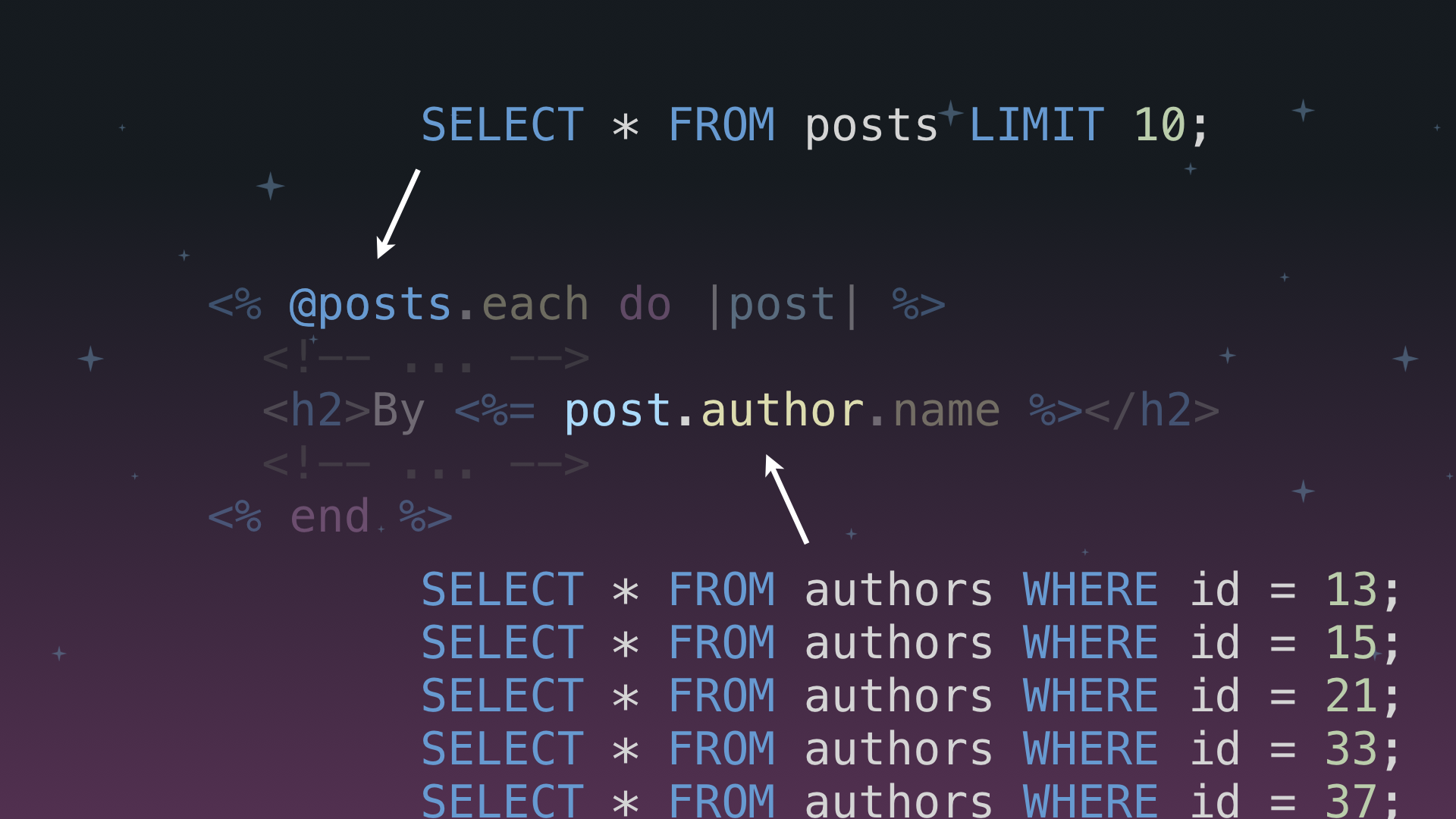
N+1 queries can be hidden within our code, leading us to doing something annoying, like issuing 10 additional queries to the database when we thought we were only making one query!
Optimizing For OSEM
When looking at OSEM's performance dashboard on Skylight, we noticed that a few endpoints had a database heads up icon attached to them, which indicated repeated queries that could be consolidated to improve performance.
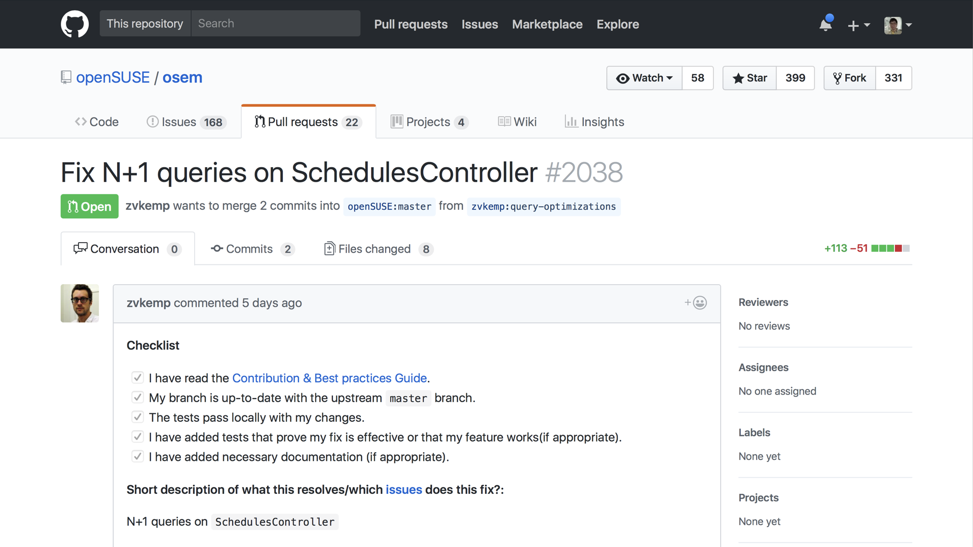
We decided to focus on investigating one of these endpoints, which eventually led us to discover a few cases of the classic N+1 query problem on one particular controller: the SchedulesController. We ended up submitting a pull request to address the issue using Active Record's includes API.
In part II of this series, we'll be diving into a more complex database indexing optimization that we implemented to optimize another open source app, The Odin Project. Be sure to check back soon for the next installment in our Skylight for Open Source Series!
Interested in joining the Skylight for Open Source Program? Learn more and see other open source apps in action! Want to use Skylight for your work apps, too? Sign up for your 30-day free trial! Or refer a friend and you both get $50 in credit.