The Log-Normal Reality
I took some time off in October to visit my friends and family in Hong Kong. When I returned from my vacation, I was very excited to see that we had shipped our new design for the endpoints page.
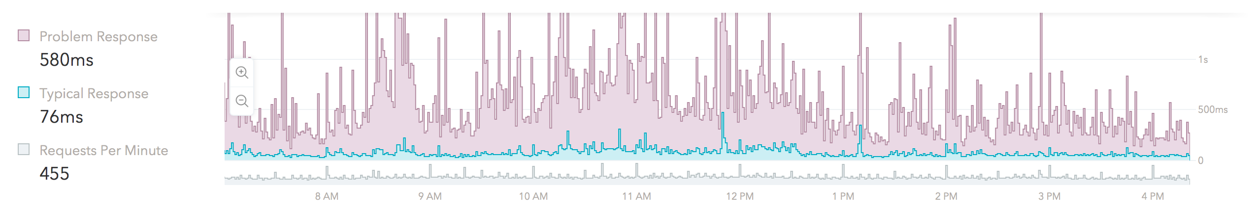
If you haven't seen it yet, go ahead and see it in action with data from your own apps! Here is what it looks like in our app:
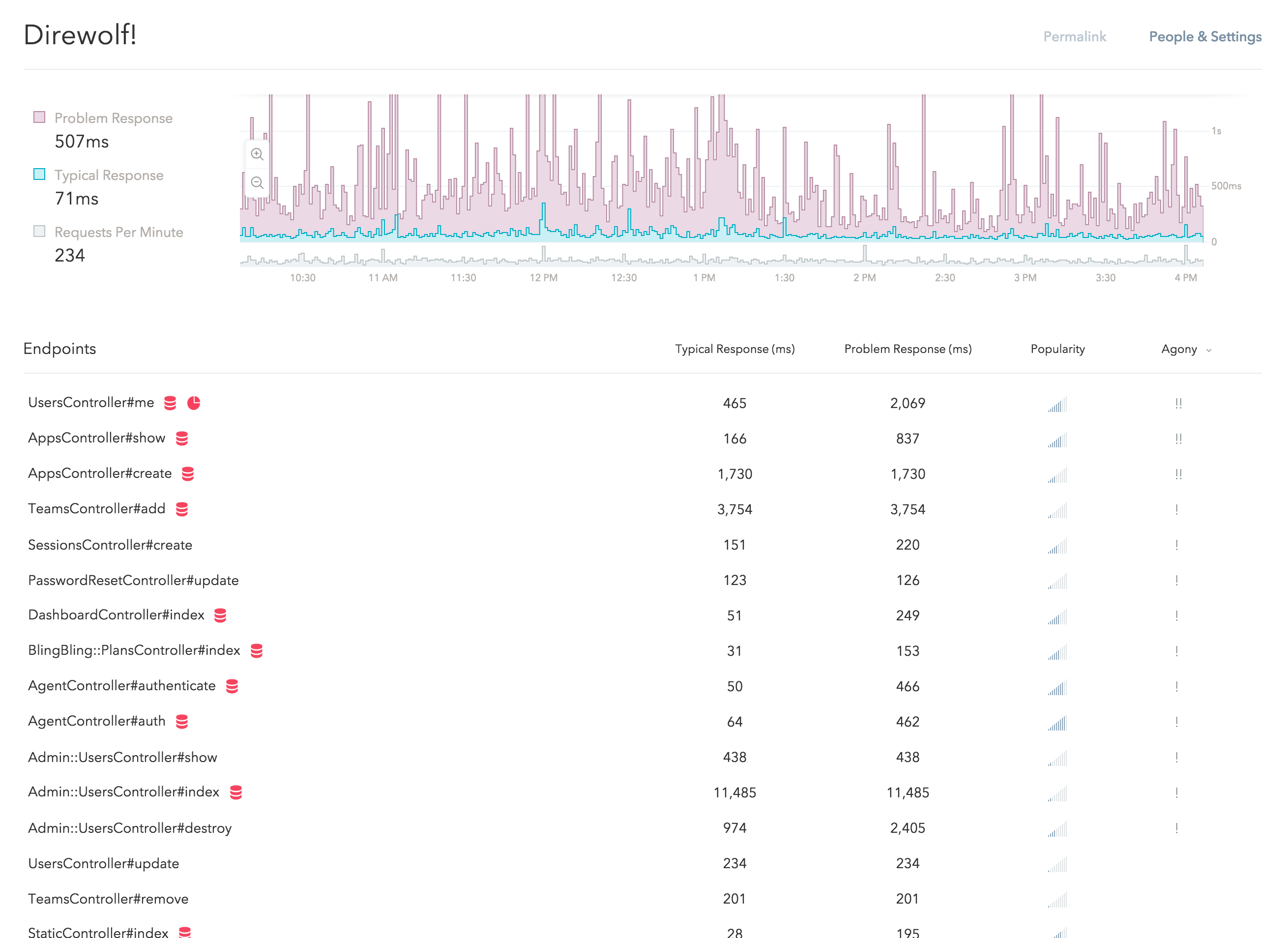
This new design is a small part of the redesign project we are currently working on. We have put a lot of thoughts into the designs and I would like to tell you some of the stories behind them.
Let's begin by learning some basic statistics.
This is the graph of a normal distribution, also known as the "bell curve":
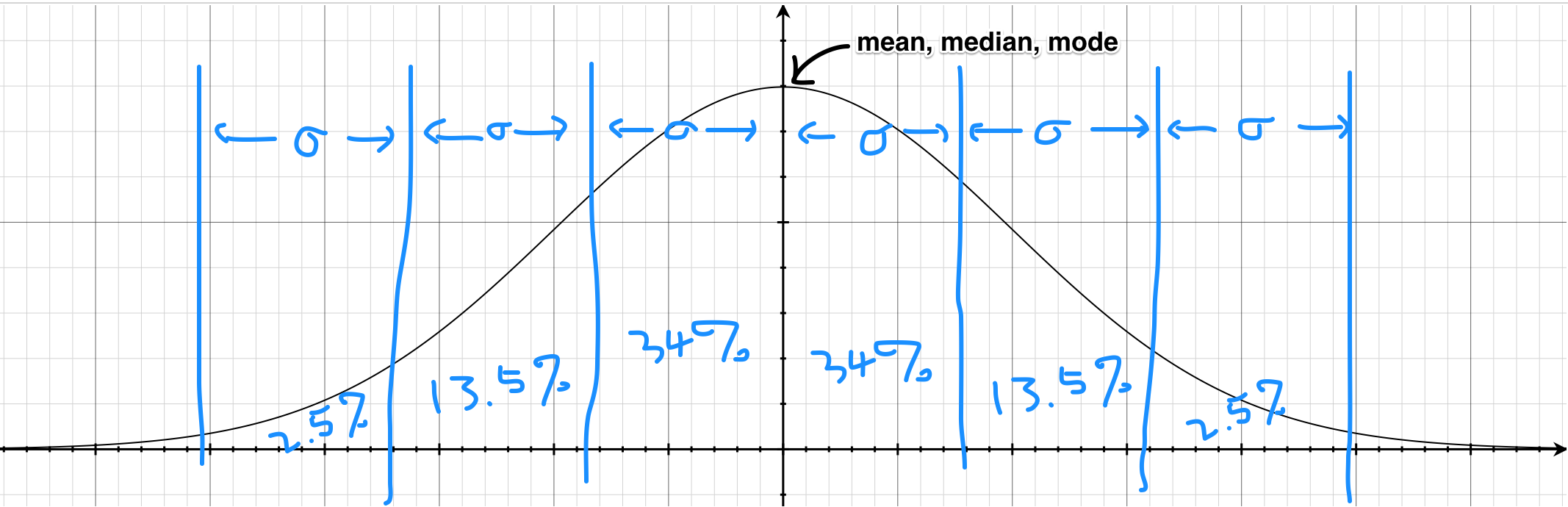
This is probably the one thing that everyone remembered from their statistics class. In fact, in a lot of curriculums, this is the only statistical distribution they teach – for good reasons.
The symmetric nature of the normal distribution makes it relatively easy to understand and results in some pretty nice properties as well. For example, the mode, mean and median are all the same. It is also a very useful tool to have when studying natural sciences as many things in nature are roughly normally distributed (e.g. human heights).
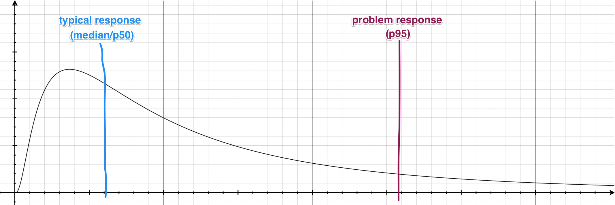
On the other hand, here is its lesser known cousin, the log-normal distribution:
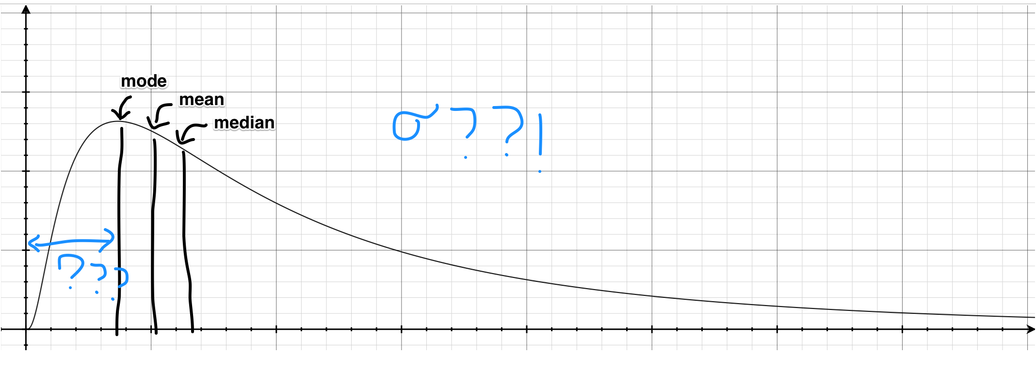
For most of us, this is much less familiar than the "bell curve". Since the log-normal distribution is heavily skewed (not symmetrical), almost none our "bell curve" intuitions apply here – for instance, the mean and median are all different and none of them on its own tell you the full story about the distribution.
Unfortunately, a lot of things in reality (e.g. income distribution, city sizes, latencies) are much closer to the log-normal distribution than the "bell curve". If we apply our "bell curve" intuitions when reading these statistics, the result could quite literally be disastrous. (As they say, all public policy issues can be fixed by making everyone take a class in statistics!)
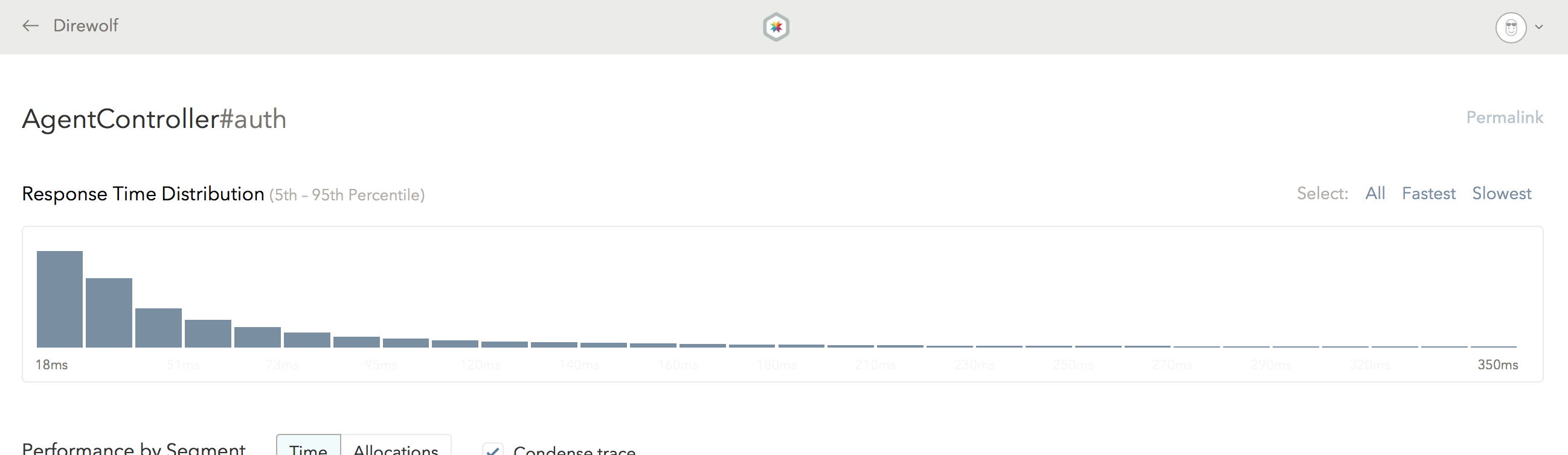
As a Skylight user, you are probably familiar this shape already – your endpoints' respond time distribution probably look something like that! (If you don't believe me, go ahead and check your histograms on Skylight!)
At Skylight, we knew from day one that the log-normal reality will be our biggest enemy. Because our "bell curve" intuitions are so strong, we need to work extra hard to help our users break out of that trap. For instance, that is why we have histograms instead of just reporting averages.
In this latest design iteration, we doubling down on that front.
Most notably, since our intuition about means and medians doesn't work on log-normal distributions, there really isn't One True Number™ that we could report for your app and endpoints.
As a result, we have replaced the (average) "response time" numbers with two new metrics – the typical response time and the problem response time (the 50th and 95th percentile, respectively), which is why there are two lines on the new response time graph and there are now two columns on the endpoints table.
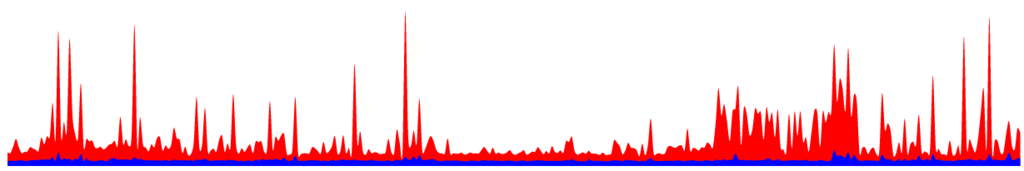
If you look at the new response time graph, you might notice that the purple area dominates the graph and there are very little blue "ink" on it:
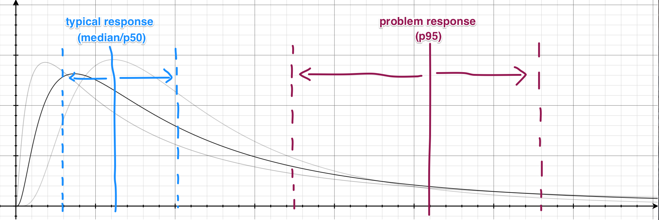
This is by no accident. If we visualize the overall response time of our app on a graph, it would look like this:
As you can see, because the response time is roughly log-normal distributed, the typical response (50th-percentile) is always going to be on the far left. On the other hand, the problem response (95th-percentile) will naturally be on the right-hand side.
As your response time distribution changes over time, these percentile values will also move left and right accordingly. It is expected that the typical response time will be relatively consistent, while the problem response time will be much more volatile due to unpredictable random hiccups in your app (e.g. rendering the page with 5000 comments on it).
The response time graph is essentially graphing the movements of these percentile lines over time. If you rotate this graph by 90 degrees, that's exactly what you get:
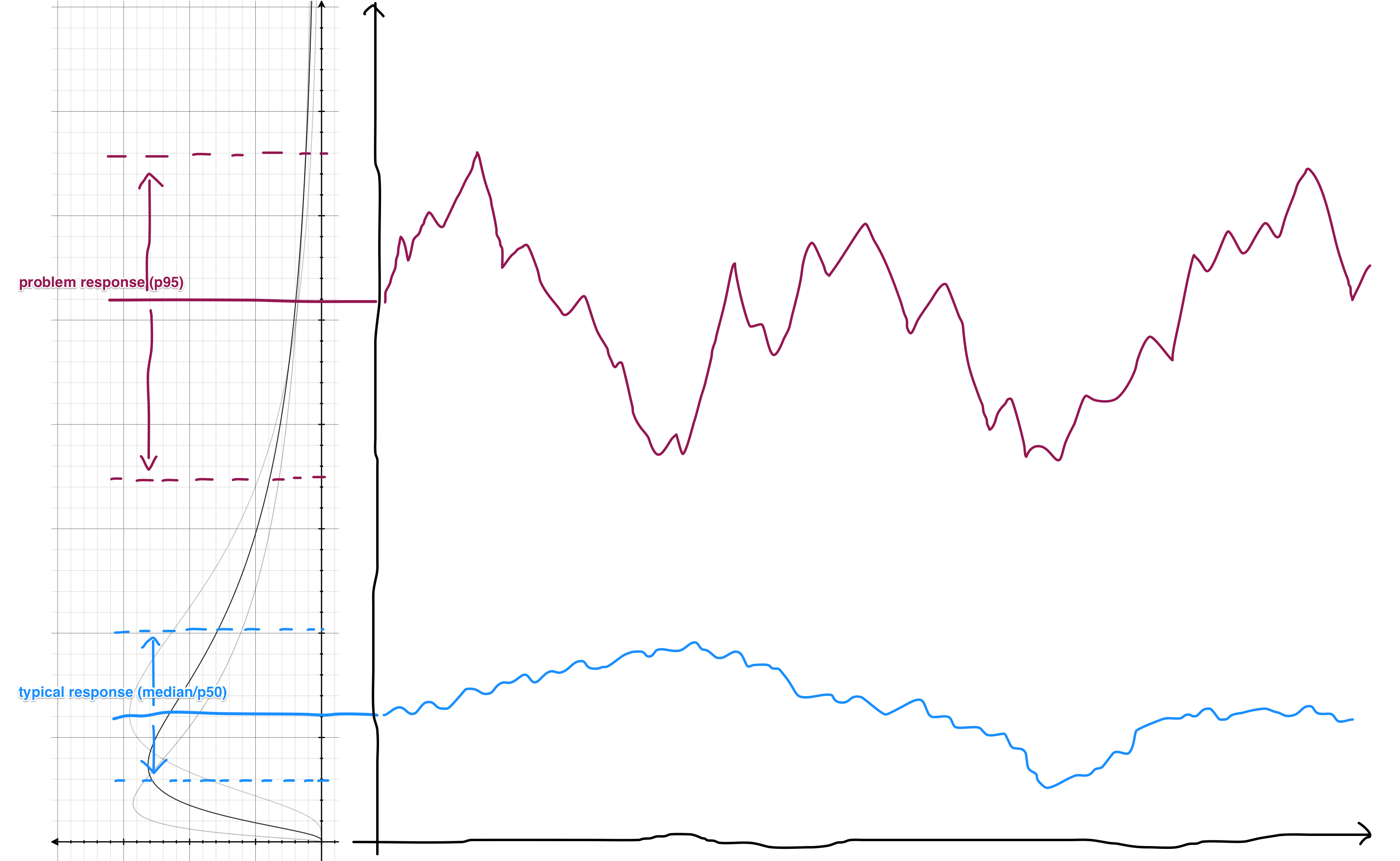
This is why the response time graph is dominated by the purple.
Unfortunately, this makes it pretty difficult to see any changes in the typical response part of the graph. The standard solution to this problem is to plot the graph on a logarithmic scale (which in fact matches the underlying distribution here). For example, a response time graph that normally looks like this:
...will look more like this when plotted on a logarithmic scale:
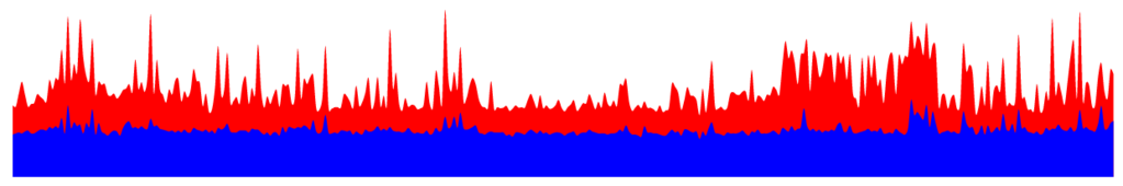
As you can see, the logarithmic scale "boosts" the lower-end of the graph, making small changes easier to see.
However, this presents a different problem: most of us have a pretty strong intuition with the linear scale and aren't used to looking at graphs with a logarithmic scale. For example, from looking at the second graph, our intuition tells us that the problem responses are "only" twice as slow as the typical responses, which is far from true in reality.
We tried various tricks to help us break out of the preattentive visual processing here, such as introducing a "tear" to separate the two series, or adding a toggle for the two modes, but none of the approaches worked as well as we hoped.
In the end, we chose to plot the graph on a standard (linear) scale and developed the intelligent zoom feature which allows you to zoom in and out as needed. We dynamically determine the number of available zoom levels based on the data we are presenting, so that you can get your questions answered with the fewest number of clicks.
Finally, the new endpoints list features a popularity indicator to help you determine the relative popularity between your endpoints at a glance, instead of showing you the raw RPMs and make you do the math in your head (you can still get to the RPMs by hovering over the indicators).
In our original designs, the popularity indicator is simply a rectangular bar:
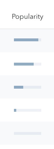
However, it turns out that endpoints popularity (RPMs) are also (surprise!) log-normal distributed. A lot of apps have a few extremely popular endpoints (e.g. the front page) and the rest of the app are exponentially less popular as the traffic drop off. As soon as we tried our design on real-world data, we immediately realized that these bars are either almost completely filled or have virtually no "ink" in them.
Once again, the solution that immediately comes to mind is "logarithmic scale". Unfortunately, that presents the same problem as before – our instincts with sizes are causing us to process the information incorrectly; we tend to think that bars with twice the "ink" has twice the RPMs.
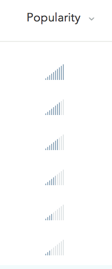
We tried a number of approaches such as using concrete shapes (similar to a star rating system). Eventually, we arrived at the "signal bars" indicator we have today, which is perfect for the job – we are not trained to think that a 4-bar reception is "twice as signal-y" as a 2-bar reception. (By the way, volume and wireless signal strengths are indeed logarithmic!)
That is probably too much statistics for one blog post!
Fortunately for you, our mission here at Skylight is to have us do the hard work of learning the statistics so our users won't have to. This is why we put so much thoughts into every little detail of our designs and try to come up with intuitive terminologies like problem response time. We want to build an intuitive product that everyone can benefit from without having to first take a class in statistics.
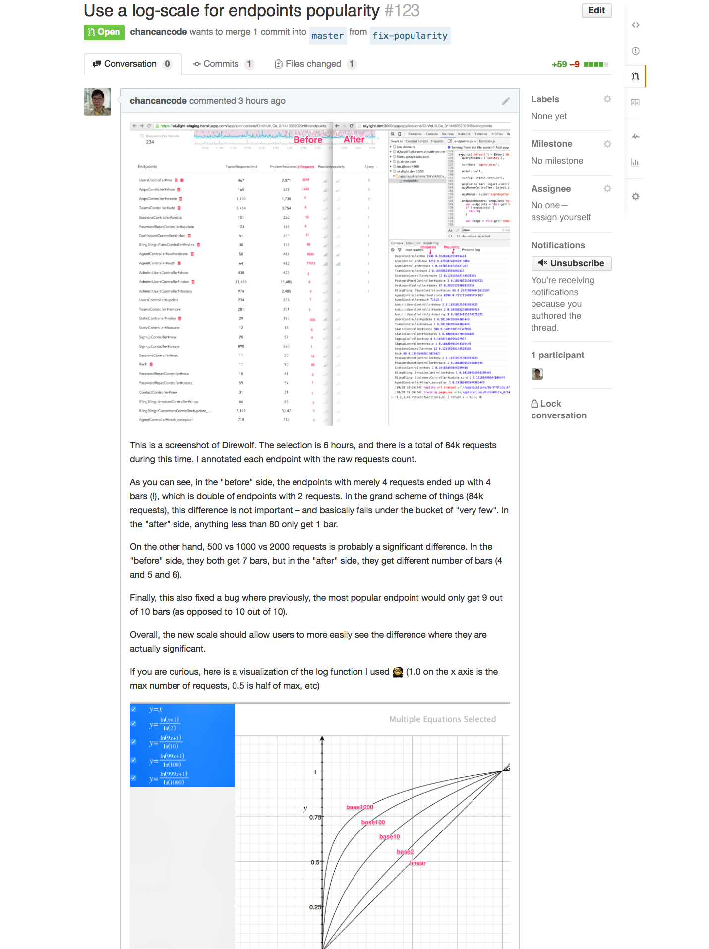
In fact, I just spent yesterday fine-tuning our popularity algorithm to help better surface significant differences and mask unimportant ones:
We will continue to work hard on our mission. We are all really excited about the new direction we are headed with the next iteration of Skylight, and I can't wait to reveal them to you!
Skylight delivers easily understandable and actionable performance data to your team. Sign up today and your first 30-days are free. Or, refer a friend and you both get $50 in credit.